Devoted to Colors
︎︎︎ 03
Under washes of color & The Impact of Hue
For centuries, the use of color and light have been used as alternative forms of medicine and therapy. This type of color medicine – or chromotherapy – dates back to 2000 BC when ancient Egyptians and Greeks used colored minerals and stones, dyes, painted rooms, and more to treat various diseases. As present-day designers, we acknowledge the medicinal benefits of color – but we're leaning even more deeply into its psychological effects.
︎︎︎
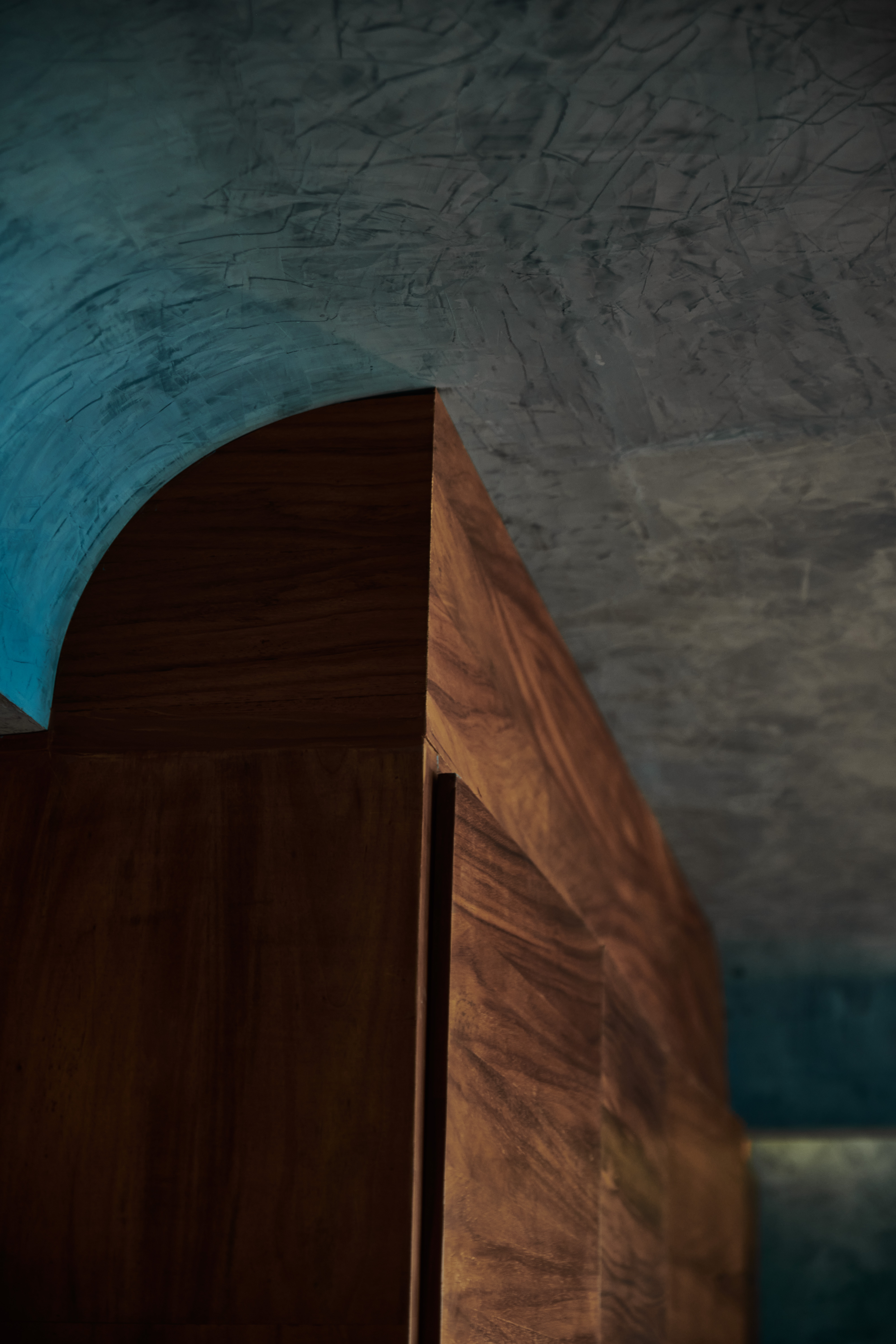
Taking note of color’s effect on mood is particularly important when designing spaces that are created for rest and relaxation. In wellness spaces, we lean towards colors that increase calm, balance, and reflection. At an immersive spa in Mexico, cenote-inspired pale blues help guests find peace and introspection. In Michigan, natural finishes and materials offer grounding and nod to the native landscape surrounding the prairie-inspired wellness retreat. Deep greens ease stress and create a soothing, comfort-filled space with pools of warm light.
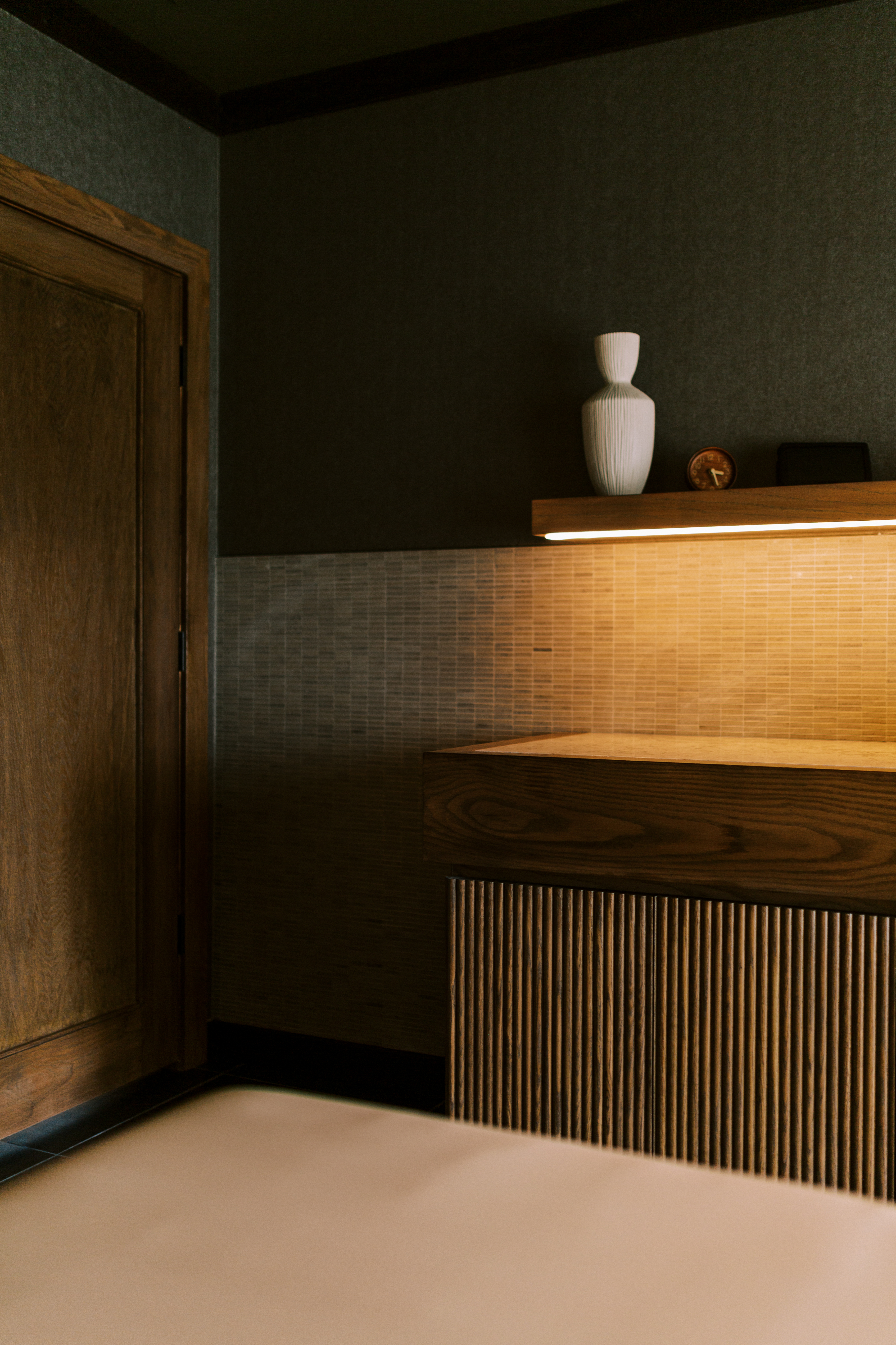
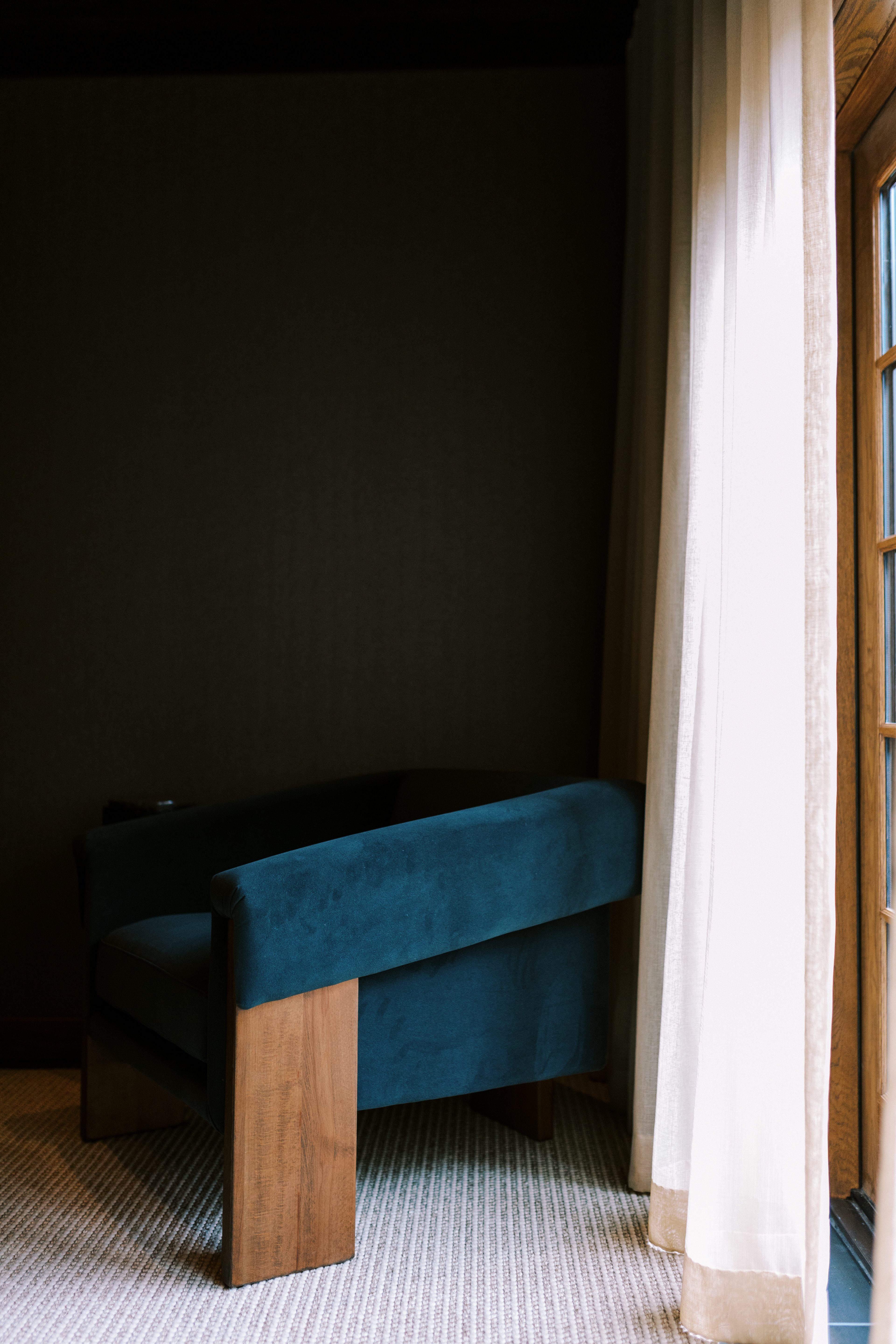
In hospitality spaces, we gravitate toward designing with colors that ground guests in their environment, increase pleasure, and support relaxation. At a Midwestern luxury boutique hotel, we use intense color to create a grounded and energizing mood, with deep reds and mauves enveloping each guest. In a southeastern Michigan harbor-side hotel, a subdued palette is inspired by its Scandinavian history, with blue hues nodding to its nautical ties.
Whether through bold washes of saturation or more subdued hues, color is an enveloping and high-impact tool in shaping guest experiences. We design not simply for how a space looks, but for how it will make a guest feel. With that in mind, we lean in to the potential effects of hue, offering guests an experience that supports their holistic self, encourages rest, and sees them off more invigorated than when they arrived.